Version 7-2
NOTE: The following is a pictorial discussion of the Custom Form2/CRM module (v.0.7.2).
Text
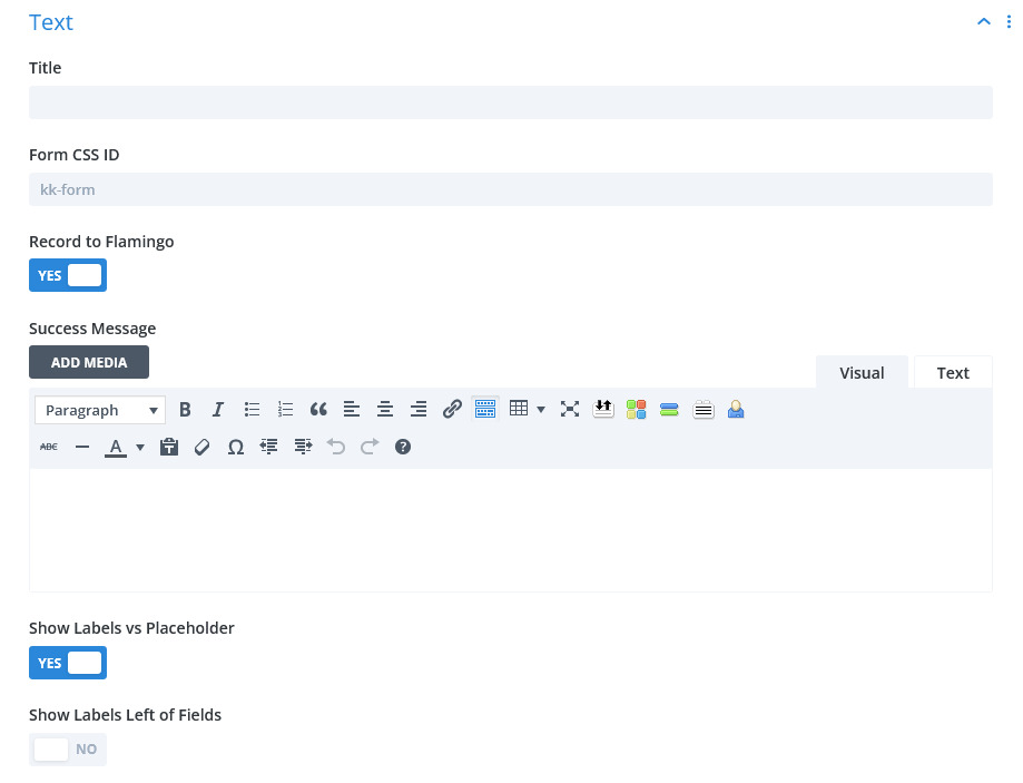
TEXT:
TITLE: allows you to set a title for the form. It is not required.
FORM CSS ID: this field is required. The default value can be changed but it must be a single word or hyphenated. If a second (or more) form is used on the same page, it is important that the ID is unique for each.
RECORD TO FLAMINGO: a Yes setting will record all submissions to the CRM (Flamingo) for later retrieving or perusing. Should a submission email fail, the form data will still be inserted into the CRM.
SUCCESS MESSAGE: upon form submission with no errors, this message will appear below the Title of the form (if used) and the form will be hidden. You may use textual html elements to style this message but be aware that upon Updating the page to WP, some html elements may be stripped. An alternative to a success message in this field is using Redirect described below.
SHOW LABELS vs. PLACEHOLDERS: if Yes, Labels defined for each field will appear above or to the left of the various input. The accompanying SHOW LABELS LEFT OF FIELDS control determines placement.
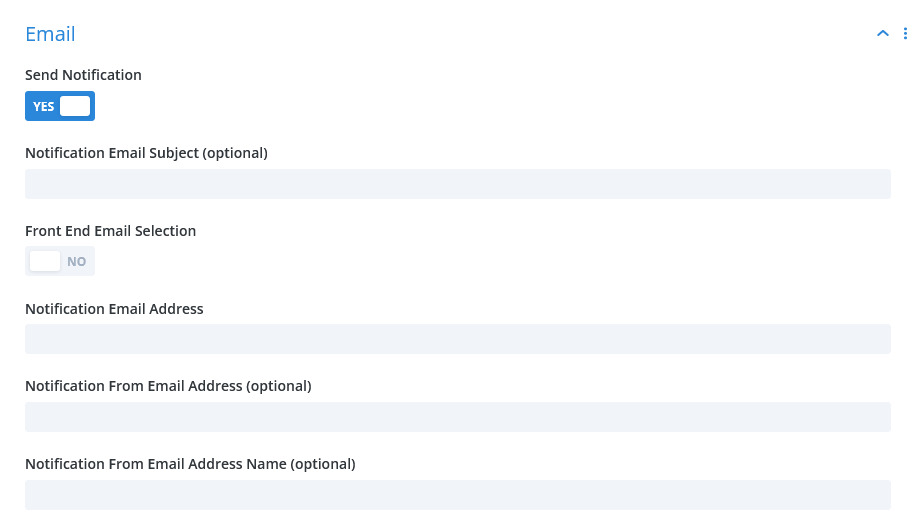
EMAIL:
SEND NOTIFICATION: set to Yes to email an address that a submission has occurred. This may or may not be always required depending on the form itself. If RECORD TO FLAMINGO is set to Yes, then form submissions will be recorded. Generally, the fields in this section are optional as explained below.
NOTIFICATION EMAIL SUBJECT: if the form does not have a subject field, enter a subject phrase of your choosing. If nothing is entered here, a default subject phrase will be used.
FRONT END EMAIL SELECTION: paired with a SELECT RECIPIENT field type within the form, this selection will allow the form user to select the destination address. If Yes, a setting will be revealed directly below this control.
NOTIFICATION EMAIL ADDRESS: enter an email address where the form submission notification will be sent. If left blank, then the site administrator email address will be used.
NOTIFICATION EMAIL FROM ADDRESS: this setting is optional and serves occasions when there is no Email Address field within the form. If this is blank, a default address is formulated. EXCEPTION: when SMTP transmission is elected, a valid email address MUST be entered if there is no email address field in the form. It should also be noted that if an email address field IS included in the form and SMTP is elected, the form user must enter a valid email address.
Elements
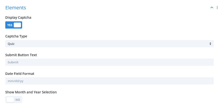
ELEMENTS:
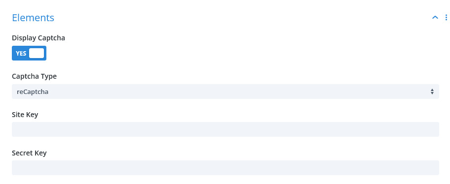
DISPLAY CAPTCHA: setting to Yes reveals CAPTCHA TYPE enables display of captcha next to Submit button.
CAPTCHA TYPE: you may choose between the usual Divi quiz or Google reCaptcha v2. Choosing the latter reveals additional fields SITE KEY and SECRET KEY which are obtained through Google.
SUBMIT BUTTON TEXT: enter desired text for the button in lieu of the default (SUBMIT).
DATE FIELD FORMAT: formulate a date format using the guide below entry. The default is given.
SHOW MONTH AND YEAR SELECTION: if Yes, the YEAR RANGE setting is revealed to allow formatting a range of Years that will be presented to the user to navigate quickly in the date field popup.
Redirect
REDIRECT:
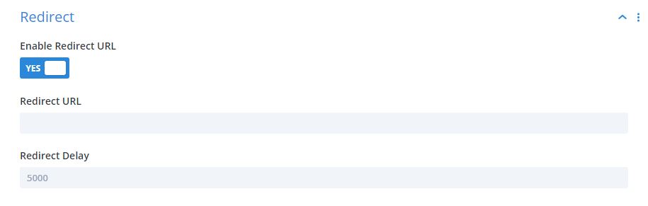
ENABLE REDIRECT URL: if Yes, the REDIRECT URL and REDIRECT DELAY controls are revealed to set the URL and delay of the redirect. The delay setting allows showing any Success message input above before redirecting. Setting the delay to 0 (zero) will cause immediate redirect.
Common Field Settings
Common Field Settings:
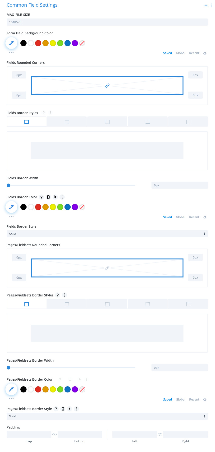
MAX FILE SIZE: enter the Maximum File Size allowed for uploading through the form. Individual input fields can be set to a maximum of this amount. The value should not have punctuation.
FORM FIELD BACKGROUND COLOR: choose a color for the background of input fields or leave default.
INPUT BORDER RADIUS: enter a radius for the corners of every applicable input field. The default unit is px, but you may override by manually entering the unit.
CUSTOM PADDING: this control will set padding for every field. The effect will mainly be the overall sizing of each field.
Text Settings
Text Settings:
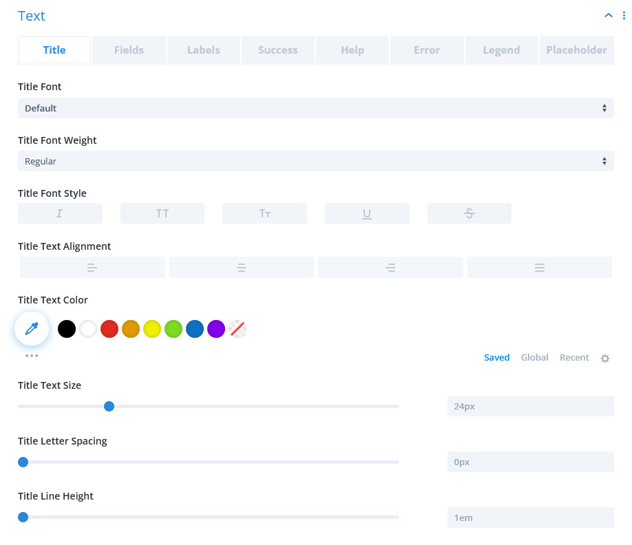
There are a series of text settings for various entities and elements in the form. The controls should be familiar. Included are settings for TITLE, FORM FIELDS, FORM FIELD LABELS, SUCCESS MESSAGE, FIELD HELP, and FIELD ERROR.
Submit Button
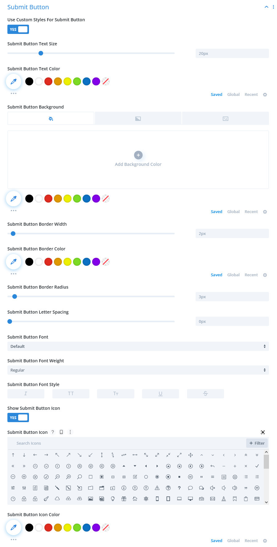
SUBMIT BUTTON: choosing Yes reveals the usual Divi styling options for buttons.
Multi-Part Buttons
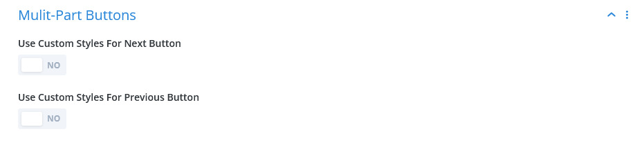
Multi-Part Buttons:
As in the Submit Button styling control, USE CUSTOM STYLE FOR NEXT BUTTON and USE CUSTOM STYLE FOR PREV BUTTON can be used to style these buttons. These are active in the form when the Page HTML Insert is used.
Confirmation Email Fields
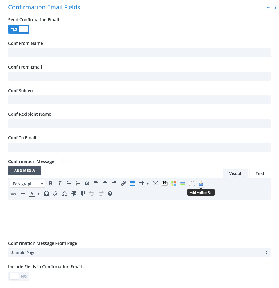
Confirmation Email Fields
SEND CONFIRMATION EMAIL: if Yes, then in addition to the notification email, a confirmation email will be sent to the form user depending on settings.
CONF FROM NAME: this is the name accompanied by the From email address. This allows you to establish your personal or company name as the source of the transmission.
CONF FROM EMAIL: this email address identifies the sender. Generally, it will be an address associated with the site domain, yet it may be any valid email address.
CONF SUBJECT: this is the subject part of the email header.
CONF RECIPIENT NAME: conceivably, this setting could be used to direct this confirmation to any recipient but generally, it would remain blank assuming that the confirmation is intended for the form user. A name field within the form is needed if this option is left BLANK.
CONF TO EMAIL: as in RECIPIENT NAME, if left BLANK, then an email address field is needed within the form. Else, a valid email address will direct the confirmation to the destination of your choosing.
CONFIRMATION MESSAGE: this allows a simple message to be included with the confirmation email.
CONFIRMATION MESSAGE FROM PAGE: if the CONFIRMATION MESSAGE option is left BLANK, then a published page can be selected from the list and its content will be included.
INCLUDE FIELDS IN CONFIRMATION EMAIL: optionally, all fields within the form will be included in the message body of the email. The format will be as in the notification email.
SMTP Settings
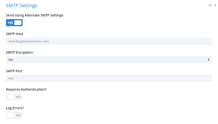
SMTP Settings
NOTE: depending on the situation, it may be advisable or necessary to use the NOTIFICATION FROM EMAIL ADDRESS and the NOTIFICATION FROM EMAIL ADDRESS NAME settings located in the module Content settings tab. This may be based on the email service’s requirements. Any errors regarding this may be within the email.log file mentioned below.
SMTP HOST: enter the domain where your email service resides.
SMTP ENCRYPTION: establish what encryption type is prescribed by the email service and then choose the appropriate entry in the control list: None, SSL or TLS.
SMTP PORT: establish what port is prescribed by the email service and enter.
REQUIRES AUTHENTICATION?: establish if the email service requires authentication.
SMTP USER/SMTP PASSWORD: if authentication is required, this input pair must contain the prescribed user and password of the recognized email service authorized account.
LOG ERRORS?: if Yes, a log file located in this plugin’s root folder will contain error messages associated with a failed email transmission and can aid in trouble-shooting.
Common Field Settings
Common Field Settings
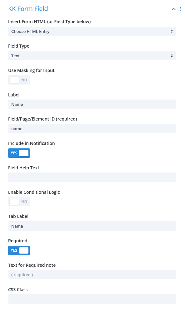
INSERT FORM HTML: this setting offers several non-input HTML choices to add to the form. These are discussed in another tab.
FIELD TYPE: this setting offers several form input types. These are discussed in another tab.
LABEL: most every input type requires a Label. It “labels” for the form user what content is required or allowed i.e. Name.
FIELD/PAGE/ELEMENT ID: this is the underlying “id” attribute for each form element. It is critical to identifying the input for processing. This ID must be a single word though may be hyphenated. No spaces or other punctuation is allowed.
INCLUDE IN NOTIFICATION: this control indicates if this particular field should be included in the notification email. There may be occasions when including is not necessary particularly if recording to Flamingo is activated.
FIELD HELP TEXT: if needed, this content will be added below the input field and serve as a guide to the form user.
ENABLE CONDITIONAL LOGIC: if Yes, additional settings will be revealed to setup conditional logic for the individual field.
TAB LABEL: this is an admin label for the field.
REQUIRED: if Yes, the field will have Required status and must have content or be chosen. An additional setting will be revealed allowing custom notation.
CSS CLASS: Enter classes seaparated by spaces that will be unique or common to other fields.
Page
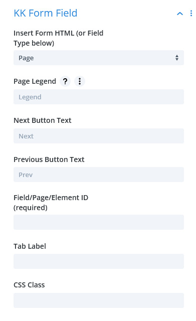
Insert Form HTML
The PAGE selection is a demarcation inserted around other fields in the form definition. Fields below this entry up to the next will render in one form frame while those beyond will be hidden until a paging action occurs. See the various examples.
PAGE LEGEND: though accurately named, this is similar to any other reference to titles. Ideally, this will describe what this form page is about.
NEXT BUTTON TEXT/PREVIOUS BUTTON TEXT: each Page will have a “Next” and “Prev” button except for the first and last. These controls allow changing the text within the buttons for each Page.
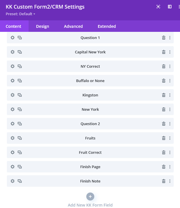
In the illustration of a form build on the below left, the entries "Question 1", "Question 2" and "Finish Page" are all Page field types. In order, these are pages 1, 2 and 3. This form can be seen here.
Note
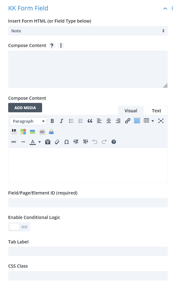
Insert Form HTML
The NOTE selection provides for inserting formatted text through out the form.
COMPOSE CONTENT Textarea: this textarea is good for a simple one line Note. It can be placed anywhere within the form.
COMPOSE CONTENT tinyMCE: this editor allows composing a complex Note including media and other textual components. This can be inserted anywhere within the form. IMPORTANT: the COMPOSE CONTENT Textarea must be empty for this control to be active.
Fieldset
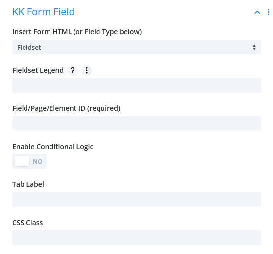
Insert Form HTML
The FIELDSET/CLOSE FIELDSET selections group fields together and allows adding a Legend and border. They must be used together to delineate which fields are included in the set. Place any number of fields between them.
Text
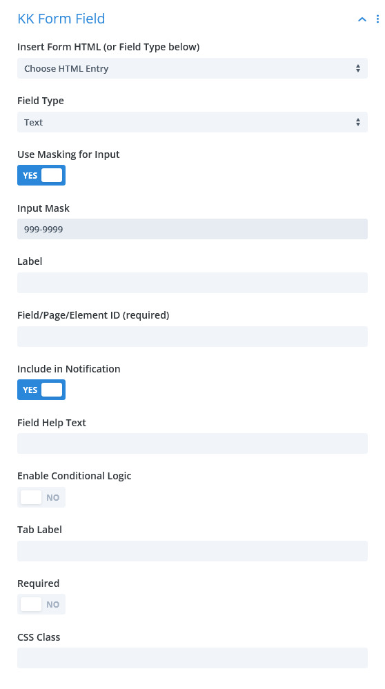
Text
USE MASKING for INPUT: if Yes, use the INPUT MASK setting to formulate a mask using the format chars to restrict input as a number, alpha or alpha-numeric entry. Examples are given in the Help text under the control.
Textarea, Email Address, Checkbox
TEXTAREA, EMAIL ADDRESS AND CHECKBOX are typical html form input types and do not have additional settings. The EMAIL ADDRESS field specifically will be validated to contain a properly constructed email address.
Radio Group
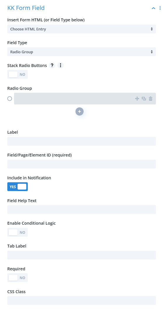
Radio Group
STACK RADIO BUTTONS: this is a styling control that renders the radios vertically. The default rendering is horizontal.
RADIO GROUP: enter a value for each radio. You may use the <ENTER> key to add an item in addition to the + or clone buttons. The Label you assigned will give the group titling.
Checkbox Group
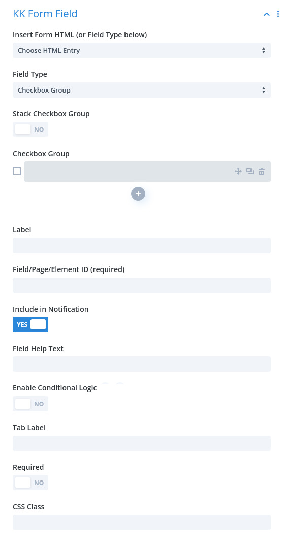
Checkbox Group
STACK CHECKBOX GROUP: this is a styling control that renders the checkboxes vertically. The default rendering is horizontal.
CHECKBOX GROUP: enter a value for each checkbox. You may use the <ENTER> key to add an item in addition to the + or clone buttons. The Label you assigned will give the group titling.
Select Dropdown and Select Dropdown Custom
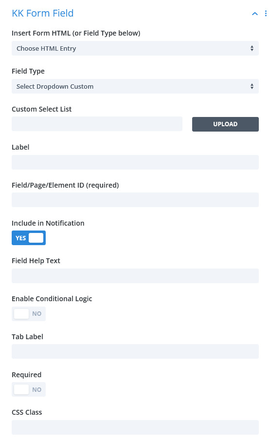
Select Dropdown And Select Dropdown Custom
SELECT DROPDOWN: this field is similar to Divi's version of the Select Dropdown field.
CUSTOM SELECT LIST: unlike in the SELECT DROPDOWN field type where you key in the value and sub-label in one entry, this field type enables uploading a text file containing the desired list. This may be in either of two formats with one option per line. The file can contain html: <option>Value</option>, <option value=”1″>One</option> or plain text: 1|One.
Select Recipient
SELECT RECIPENT works in tandem with the setting the the Content tab. This field builds a dropdown list containing the options set in Content. The names of the Recipients will appear in the dropdown.
File Upload
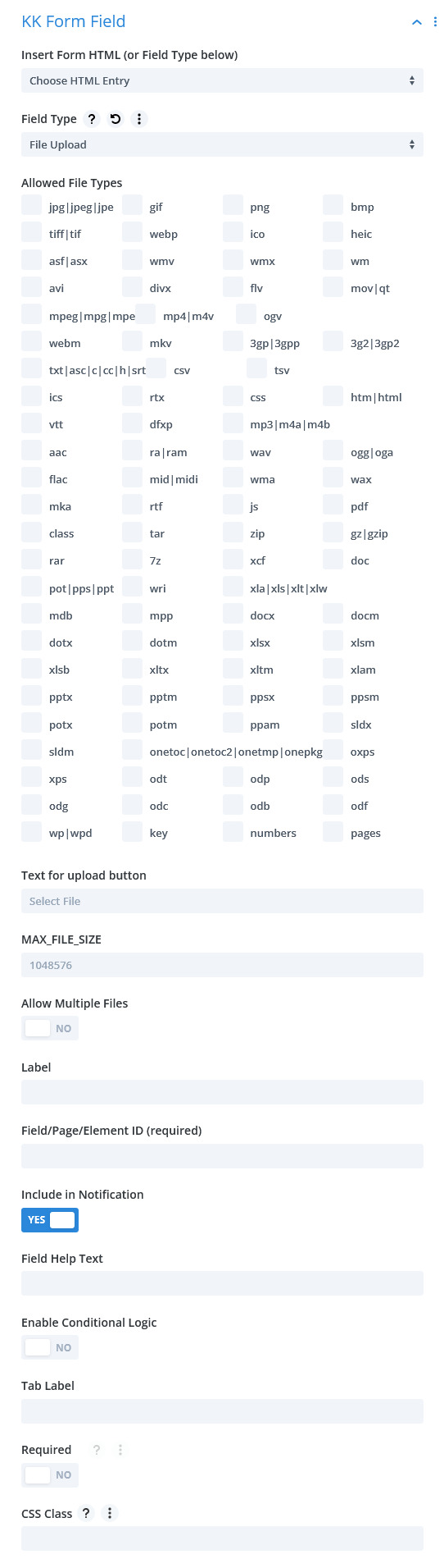
File Upload
ALLOWED FILE TYPES: this is selection list obtained from WP Core. You may restrict the mime types allowed to be uploaded by selecting one or more from the list. You may also elect to have multiple upload fields in the form to better instruct or restrict the form user. NOTE: this list can be modified to contain fewer choices by using a filter as explained in Tutorial->Snippets. It has also been discovered that in some international WP installations, this default list can become corrupt. The filter mentioned can be used to counteract this problem.
TEXT FOR UPLOAD BUTTON: use the default wording or supply you own.
MAX_FILE_SIZE: if desired, this control restricts file size in bytes that the user may upload. This should be no greater than the common setting discussed elsewhere. Further, the user may be bound by php configuration, as well.
ALLOW MULTIPLE FILES: consistent with other settings for the field, this control will allow users to upload multiple files by selecting multiple files from their source.
Number
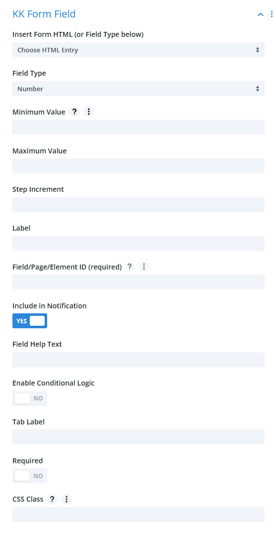
Number
MINIMUM VALUE/MAXIMUM VALUE: these controls restrict the range of values that can be entered.
STEP INCREMENT: if the user chooses to use the Step button in the field to increment value, this control establishes that increment. For instance, if one click should produce an increase or decrease of five in the value, then the numeral 5 should be entered here. It should be noted that users can keyin a value of their choosing bypassing any incremental setting.
Hidden
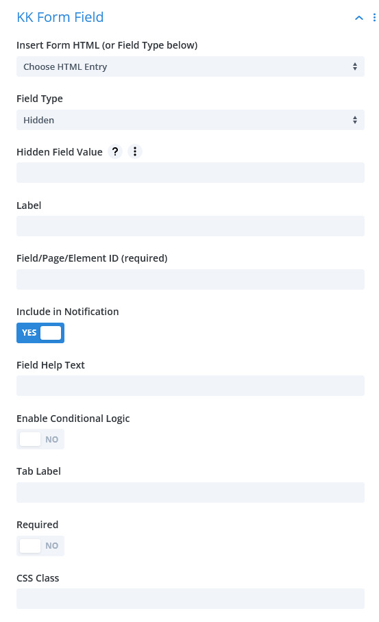
Hidden
HIDDEN FIELD VALUE: generally, a hidden field is used by code that processes the form submission to determine a proper course, etc. It can also hold some info useful to the notification recipient that is not necessarily provided by the form user. That value or info is entered here.
Acceptance Checkbox
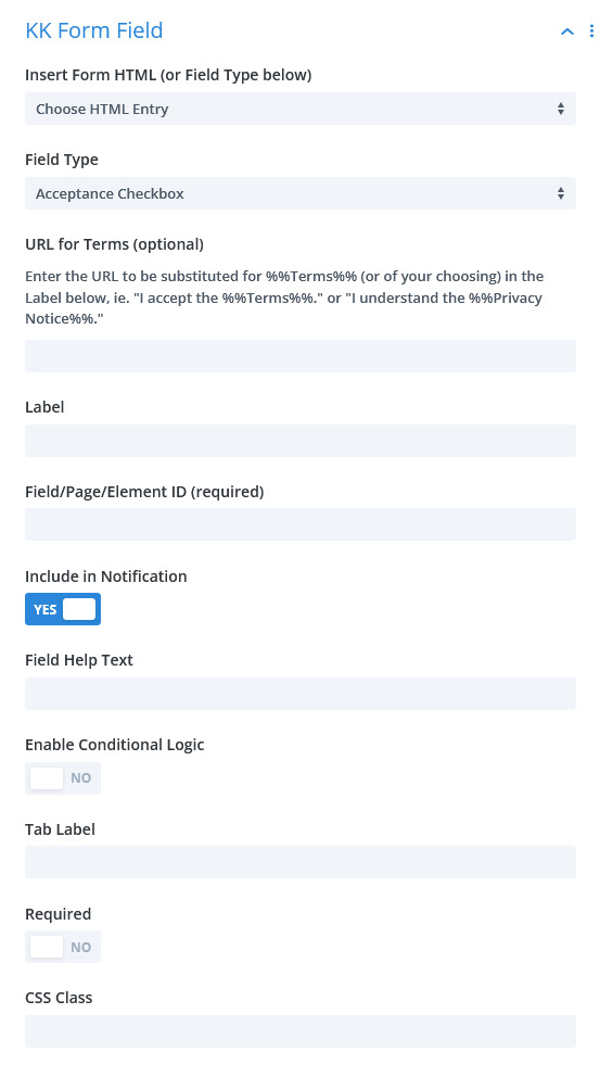
Acceptance Checkbox
URL FOR TERMS: provide a URL that contains info for the user to accept or agree to. This URL works in conjunction with the field Label by providing a phrase as in %%Terms%%. The word Terms is arbitrary and can be any word or phrase. The %% sequence is necessary to delineate the phrase that will become linked to the URL.
You must make this field Required in order to have the linkage built, else, it will be an ordinary checkbox.
Layout
LAYOUT:
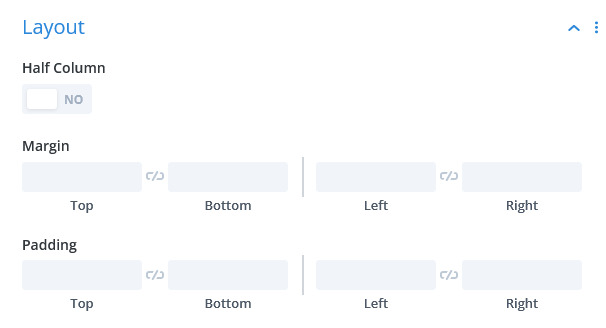
HALF COLUMN: this control is carried over from previous versions of this plugin. It is still viable when the layout design calls for two columns. Typically, the designer will group two adjacent half-column fields together to effect a two column row within the form.
CUSTOM MARGIN AND PADDING: adjust the padding for this individual field.
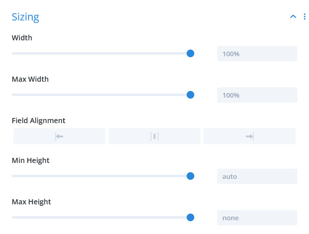
Sizing